

Green City Force
BRAND
DESIGN
Green City Force is a non-profit based in Brooklyn, NYC that trains inner-city youth in job skills and the green economy. We developed their original logo set: a 3D bold treatment that represented their ambition, and a simplified “birds-eye view” for use on funding materials. Over the past 10+ years the organization has grown and gained an incredible reputation, training and fostering our youth to be a force in this world. They have really made the brand their own.
Project done as a designer & project lead at Celery Design Collaborative
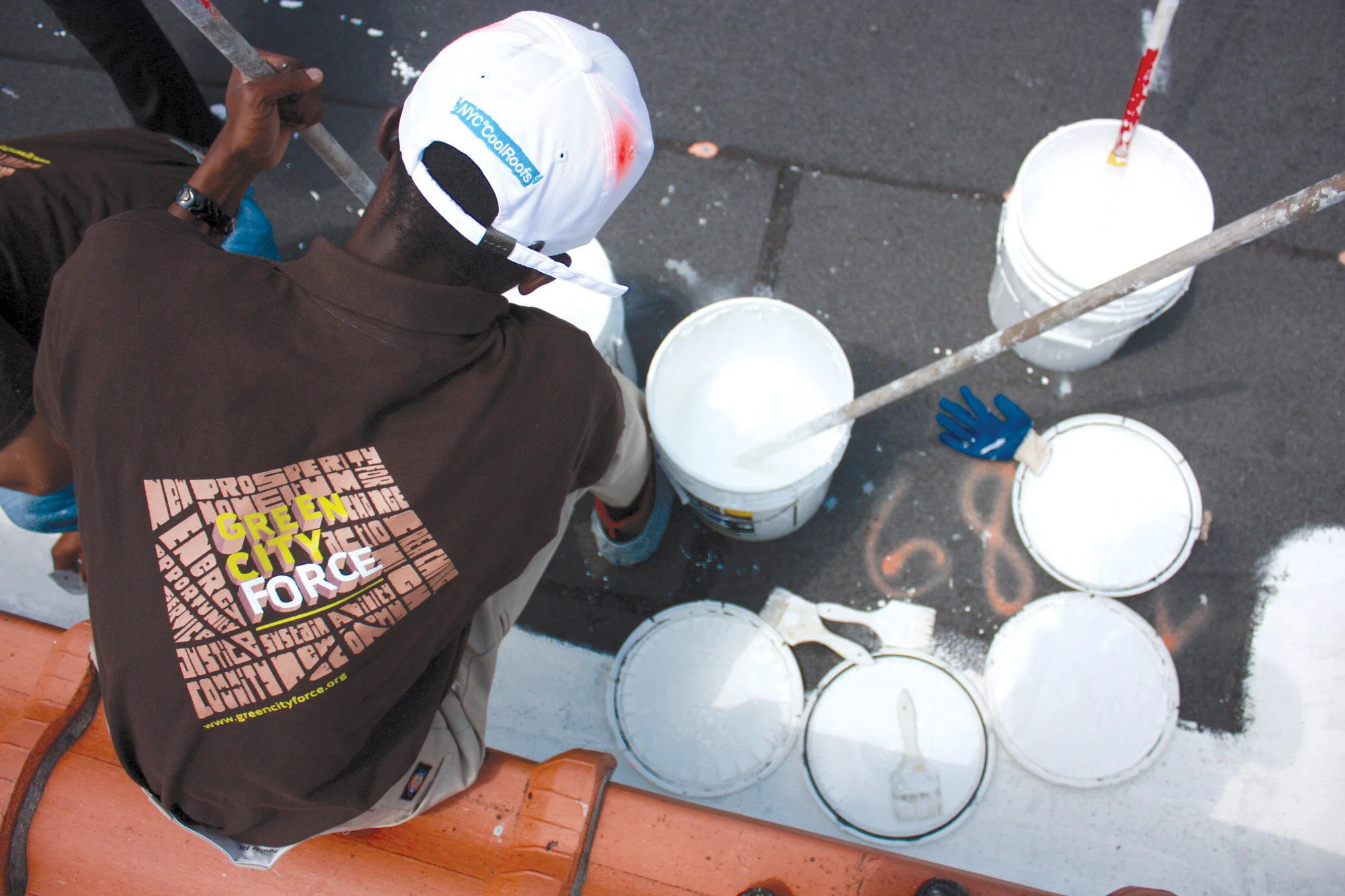
photo courtesy of Green City Force
The Corps uniform
The corp member uniform was the brown shirt with the “perspective” logo on the back, and the “birdseye” logo on the front (below). The words in the perspective logo grow to shape the city buildings, with adjectives hand-lettered around to mimic the city blocks.
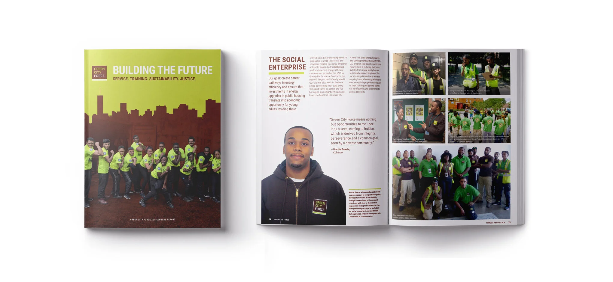
2019 Annual Report (above)
Their first annual report was produced after 10 years of paving their journey. They saw this as a key investment to help convey their impact and support their funding efforts.
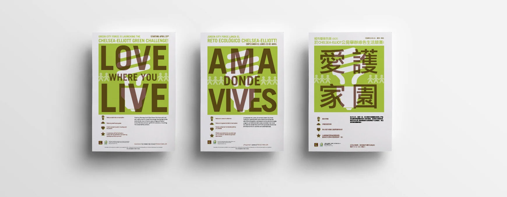
Love Where You Live (below)
The Love Where You Live campaign was one of their early on initiatives that educated public housing residence on the importance of saving energy. Cohorts, who were residence in New York City public housing residents themselves, went door to door and practices talking to strangers, learning education skills, social skills, and gaining confidence in their community. Communication - mainly flyers - were translated into 2 additional languages.
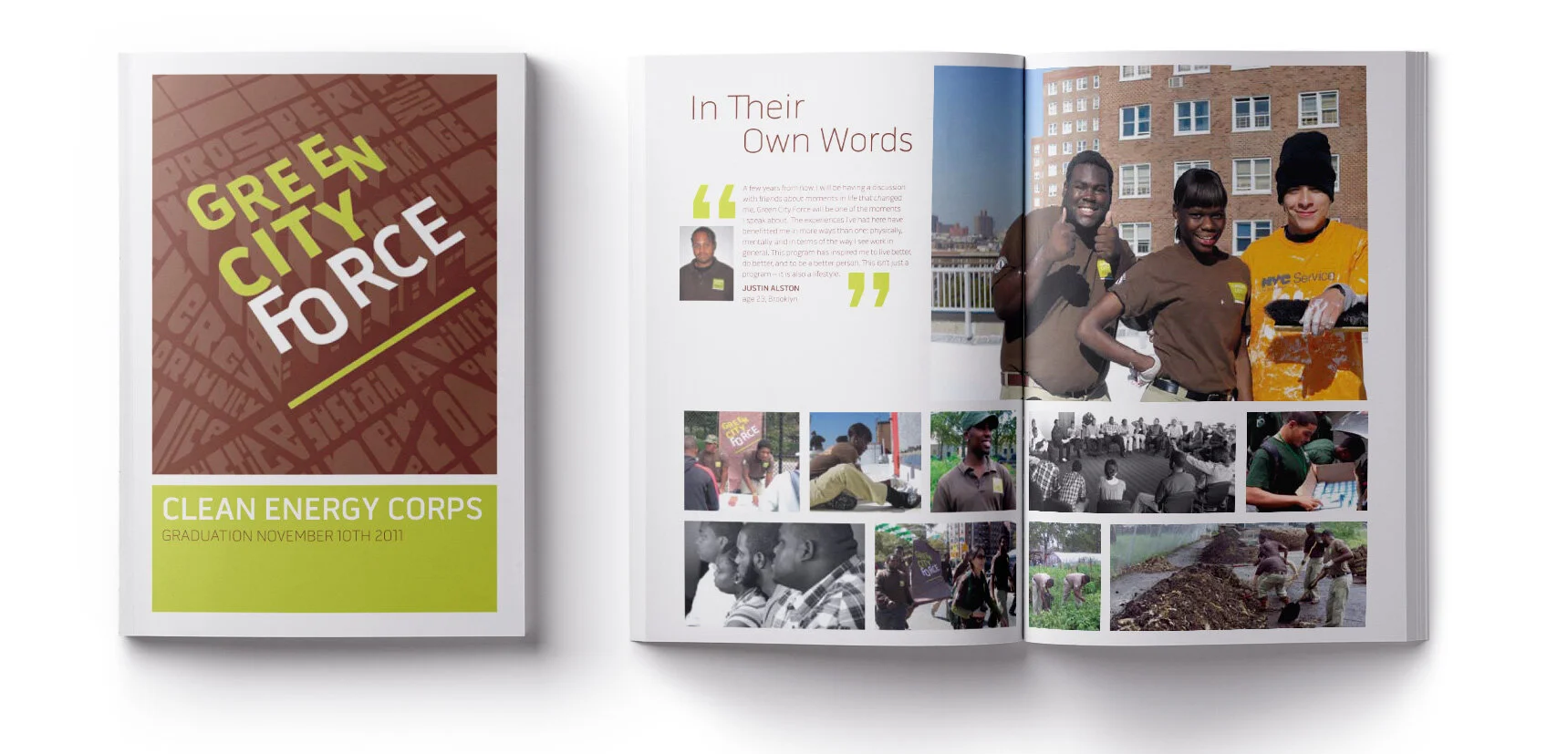
The Graduation booklet
Each cohort receives a graduation booklet that showcases the highlights of the term, and a testimonial from each corps member. The format was set up to print letter size, folded in half.
PROJECT DETAILS
CREATIVE DIRECTOR // Brian Dougherty
ART DIRECTOR // Stephanie Welter Krause
DESIGNERS // Yoonju Chung, Stephanie Welter Krause